Tuesday, December 30, 2008
all together now
With a few inbetweens, I connected the 4 walk cycles. All 4 cycles have a different amount of frames. The quick walk is only an 8 frame cycle. The sad walk is a 16 frame cycle. The skipping cycle is 12 frames. The run cycle with his arms stretched out in front of him is a 24 frame cycle, it's the longest one only because he floats when he is at his high point for several frames. Plus it's all on 2's, so the 8 frame cycle is only 4 drawings, the 24 frame cycle is 12 drawings, the 16 frame cycle is 8 drawings, and the 12 frame cycle is 6 drawings. When I clean these up the one thing I will do is really slow down the sad walk. I will double the frames from 16 to 32, to make it a very slow sad walk, like he's really dragging his feet.
Monday, December 29, 2008
HARMONY


I just came back from a trip to Toronto where I got a Toon Boom Harmony lesson from my brother. This time I took notes and actually drew a rough character and animated him a bit with the program. I learned how to draw in Toon Boom and create a character with the "draw" mode and "X Sheet" modes. I also learned the animation basics in the "time line" and "frame" modes.
Now that I am back at my place; I have Studio 4, not Harmony, so it will be interesting to see if this knowledge helps me in Toon Boom Studio 4.
The character is just a rough scribble. I did not use the Cintiq, since I wasn't planning on doing anything that looks good. I quickly drew this guy with the Wacom tablet, just to learn the interface and the tools.
Saturday, December 20, 2008
The Good Guys
Kayami's new eyes....updated
 Just another color scheme. We still have not made a decision on the kind of line to use. I am going to knock out some lines, make some lines colored, and experiment a lot more with the line.
 I think the white dots on her eyes are crucial. I can't find any other way to give her eye direction without the white dots. I am still messing around with her colors.
 I know these are not the ideal eyes to get expressions out of, but there is very good reason for designing them this way. Her eyes were more expressive in an older version but they were too similar to the main character. He is supposed to be the only "human" character, even though he is a Slinky. All other characters are not human, thus the tail on Kayami here. So I gave her these eyes to make her look more like a designer toy.
Monday, December 15, 2008
exploring Kayami
Saturday, December 13, 2008
SLAM DUNK!

There is a lot of art work, writing, sketches and ideas that are not going to make it into the bible package when we pitch this show. But all that extra art really brings the characters to life in my mind. And since I am not a fan of wasting art, I'll find a way to sneak it into the show when it goes into production.
Friday, December 12, 2008
Thursday, December 11, 2008
in action
Tuesday, December 09, 2008
logo design
Monday, December 08, 2008
the "TAKE!"

 I love the cartoon "TAKE". Sponge Bob Square Pants uses the "take", as did Ren & Stimpy, and currently I have been watching a lot of The Mighty Bee and I see them do a lot of takes in that show too. What I love about the "take" is craziness. Anything goes in a "take" and you can practically throw the model sheet out the window...as long the character pops back in model. Some of the best "takes" I have seen were on Ren & Stimpy, the characters heads would literally split in two, the exageration and expressions were out of this world.
Saturday, December 06, 2008
more extreme...updated
Tuesday, December 02, 2008
Bango tired

Had a meeting today to discuss this "Slinky" project. It went amazingly well. The bible, character descriptions, season story arcs, and episode synopsis are looking very likely to be approved by mid week. The character pictured here is all but approved, except for a few color corrections. I am very excited at the prospect of this series going into production. The characters have really grown on me.
Monday, December 01, 2008
Friday, November 28, 2008
expressions...updated
more drawings of this guy...updated
 Updated pic above.
He looks like a normal boy...until he uses his SLINKY powers. Animating a walk cycle, falling down stairs and using his Slinky powers is going to be a real challenge. I am going to need to do a lot of study on how a Slinky moves, and then create a 2D flat interpretation of it, and then figure out how it works with the character's anatomy and movement. But I am looking forward to animating him.
Thursday, November 27, 2008
Monday, November 24, 2008
never ending design...updated
Thursday, November 20, 2008
Wednesday, November 19, 2008
Line options
Tuesday, November 18, 2008
sketchy options
Sunday, November 16, 2008
still haven't nailed this character

This is the main character in this production. We know he should probably have similar proportions to these, lanky, long legged, and a large head. It gives him an active look, which fits the character description. But we are nowhere near a decision on his final design. So I will keep on sketching until I get a drawing that makes me go "Eureka!"...or as Stan Lee would say, "Excelsior!"
Saturday, November 15, 2008
Friday, November 14, 2008
back to the drawing board

 After a few weeks of mostly just writing...I am back to drawing!!
The shorter guy on the left is the old version. The rough and the middle clean versions is how he looks after the tweeks. I will still play with outlines; no outlines, a black outline, colored outlines, rough or clean lines, thick or thin lines, it is all up in the air right now. Once I get a Cintiq, I can really figure out what works best once he is animated.
Sunday, November 09, 2008
no tweeking necessary
Tuesday, November 04, 2008
rethinking a character
Wednesday, October 29, 2008
African animation
This is the intro I animated with After Effects. I have some postcards, framed on my wall, from Africa, which I used to make the BG.
Wednesday, October 15, 2008
drawing even more badly
Monday, October 13, 2008
relying on the past

Another screen shot from a couple years ago. When I have nothing new to post, I can always dig up something from past productions. Looking back on all my "Pete and Bob" posts, I am surprised I did not post a lot more from this project. This is a shot from the intro of the show, one of the few times we get to see Karzinki the driver, and Pete and Bob on the back of the garbage truck, all in the same shot.
Sunday, October 12, 2008
drawing ugly on purpose


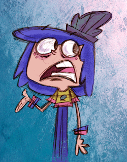
 These screen shots are from a project a couple of years ago. Click on the "Pete and Bob" label to see the other posts. It was stressed upon me to make it look "drawn really badly." It is actually more difficult to draw ugly than it is to draw a good design. It is not easy to unlearn everything you know.
Subscribe to:
Comments (Atom)


