Showing posts with label Oasis. Show all posts

Monday, October 06, 2008

the bane of my existence


This one single character design has been a source of very much frustration to me. Here's a thought; the top 4 shows of the past 20 years (The Simpsons, South Park, Family Guy, and King Of The Hill) are all horribly designed. Just goes to show that how important good character design is in a show; which is to say, not very much. The most important aspects of a show are excellent writing, clearly defined characters, strong direction, a clear vision, and good stories with good dialog. And of course it has to be FUNNY!!
What is NOT important, and a waste of time, money, and energy; is when you worry about unimportant, nit-picking details in the design. No body is going to care if Homer Simpson has 2 hairs on his head or 3 or 4. No one is going to stop watching Family Guy if Meg Griffin was designed with square glasses instead of round glasses. No one is going think South Park is any less funny if Cartman's double chin line was removed.
Not to say all shows can get away with bad designs. But you need to know what is important in each specific show you work on.

Wednesday, September 24, 2008

hockey player notes

This was one of the earlier characters designed. As you can see, compared to the characters in the previous posts, this design is way off. I had the designers completely re-designed him, unlike the others characters which only needed tweeking. I hope my notes help anyone looking at my blog, as much as they helped the character designers on this production.

more notes


The designers were getting a much better understanding of the "stlye" at this point. This character needed very little tweeking.

mermaid notes


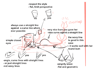
My notes again to the character designers, mostly stressing the importance of straight lines and curved lines.

my design notes

These are my notes to the character designers. The top image was not in the right "style" of the show. So I had the designer make a few tweeks and we have an incidental character design that fits with the look of the rest of the show. The designers told me that my notes were very helpful.

Saturday, August 16, 2008

a kid's a kid

I needed to design a kid character. The first one I did, on the far left, was kinda a metal kid from the 80's; looks pretty much like I looked in the 80's, the hair, the braces, the awkwardness. They felt he looked to old, more like a teen than a kid. So I put some shorts on him. They liked the long legs, but wanted him a lot smaller and younger. So I shrunk him down and gave him a shirt his Mom would buy, I also gave him freckles to look younger. Then finally they wanted the metal kid but small, so I came up with the final one on the right. Bingo!

Saturday, August 02, 2008

rough sketches of previous posts


My two favorite COL-ERASE pencils are 20043 BROWN and 20067 PURPLE. I love sketching with those colors. Most animators are so used to sketching with blue that they don't even try other colors. Traditionally non photo blue was used way back in the day when we used film and cameras. In this digital era there really is no reason to stick to blue.

Thursday, July 31, 2008

another rejected design

Very much a Bruce Timm and Shane Glines influence here.

Wednesday, July 30, 2008

rejected character

This design was rejected, she's too innocent looking. My inspiration for her is Avril Lavigne.

Tuesday, July 29, 2008

same head, different body


Personally, I think the track suit is funnier.

Monday, July 21, 2008

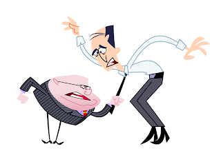
who's the boss?

Just a shot used to sell the design to the client.

Friday, July 18, 2008

sliced bread head and chicken lady

I was asked to design an old woman character, very typical, very uninteresting; as I sketched her jowls and wrinkled chin, a chicken came to mind. So I designed her as a chicken lady. I blame this one on the medication too. There was no way the producer and director were going to accept this. I made a normal old woman into a chicken! I emailed the design anyway, knowing full well it is not at all the character I was given a description of. You can imagine my shock when they told me they liked it. I got away with it again! Bread Head and Chicken Lady!

Thursday, July 17, 2008

nerd chic

She's not a nerdy chick, she's nerd chic (pronounced SHEEK).

Wednesday, July 16, 2008

who needs hair...


...when you have sliced bread!!!! I blame this on all the medication I have been taking. I pinched a nerve in my back and was literally paralyzed for a week. Then in week 2 of the pinched nerve I took tons of muscle relaxants and pain killers, the pills allowed me to stand up and do some work at my computer, but they made me pretty loopy. I came up with this design during that time. The character description I was given made no mention of his hair, bread hair or otherwise...that was all me baby!! I was pretty sure the producer and the director would take one look at this and think I was crazy. But to my surprise...they loved it! Go figure.

Tuesday, July 15, 2008

with or without an outline


I always found suits and ties to be somewhat surreal. I hate neck ties, I hate wearing suits. But I love drawing them!

Thursday, December 27, 2007

I'm on the cover!


Okay, well it's not actually ME....but it is my art. This is the cover of this month's TOON BOOM NEWS, a magazine circulated in the animation industry to promote Toon Boom software and the studios using Toon Boom programs. The cover is a design I did for Oasis Animation. There are several posts from this production in my blog archives, pretty much all of September and October 2007 archives are just from this project. Am I mentioned in the article on the inside? Nope. But there is a fascinating interview with the guy that signs my check.
My Girlfriend is also in the magazine, well it's not actually my girlfriend...but it is a caricature of her. I've highlighted her in the top picture. She is one of the incidental characters in the club scene. When I showed her the picture in the magazine she screamed and giggled like a 10 year old girl, so I think she was happy about it.

Thursday, October 25, 2007

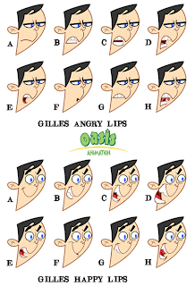
gilles lip sync

Notice I gave him different teeth in the angry positions than in the happy positions.

Wednesday, October 24, 2007

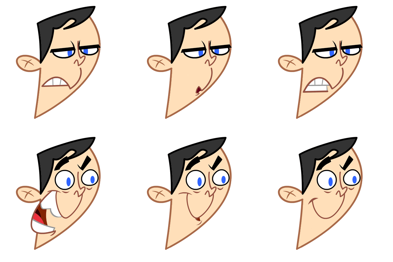
express yourself


These were just some ideas to show the range of expressions and to help the animators, they were not meant to be used exactly, just as a reference.