
You've seen the homely girl design a few posts below; now here's the hot blond bimbo design. Apparently there are lots of dumb blond jokes in this series.
 I was told to design an ugly, depressing, miserable, lonely girl. So I came up with this goth chick on the left. They didn't want her to be a goth, so she was rejected. Then they said that she wasn't supposed to be necessarily UGLY, just desperately in love with the main character, but kinda homely. So I designed the frumpy chick in the middle here. She was also rejected. They wanted her to be older, a cougar. So I came up with the design on the right. They liked that one, but I would have preferred the design in the middle as the main character. We did use all the 3 designs. The 2 rejected characters were used as incidental characters.

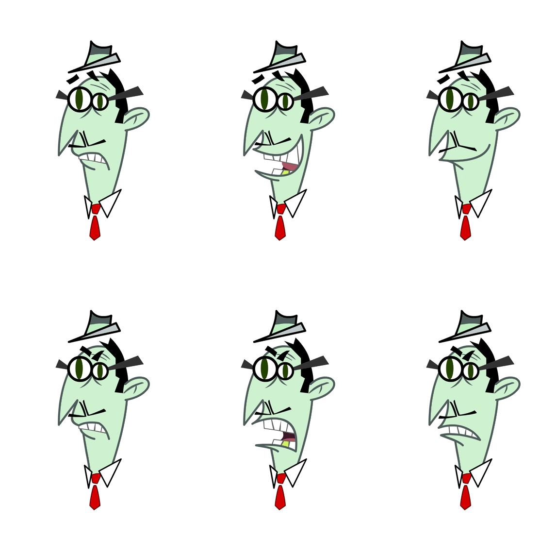
 Another lip sync. This is the 4th production that I did lip syncs on, and on 3 of those 4 I was the only one doing lip syncs. On DAFT PLANET, ZANNI, and STAND UP TV, I created all the lips by myself, and on MY GOLDFISH IS EVIL, I was on a team of 3 guys creating lip syncs. Some people don't like doing them, but I think they're fun to do.

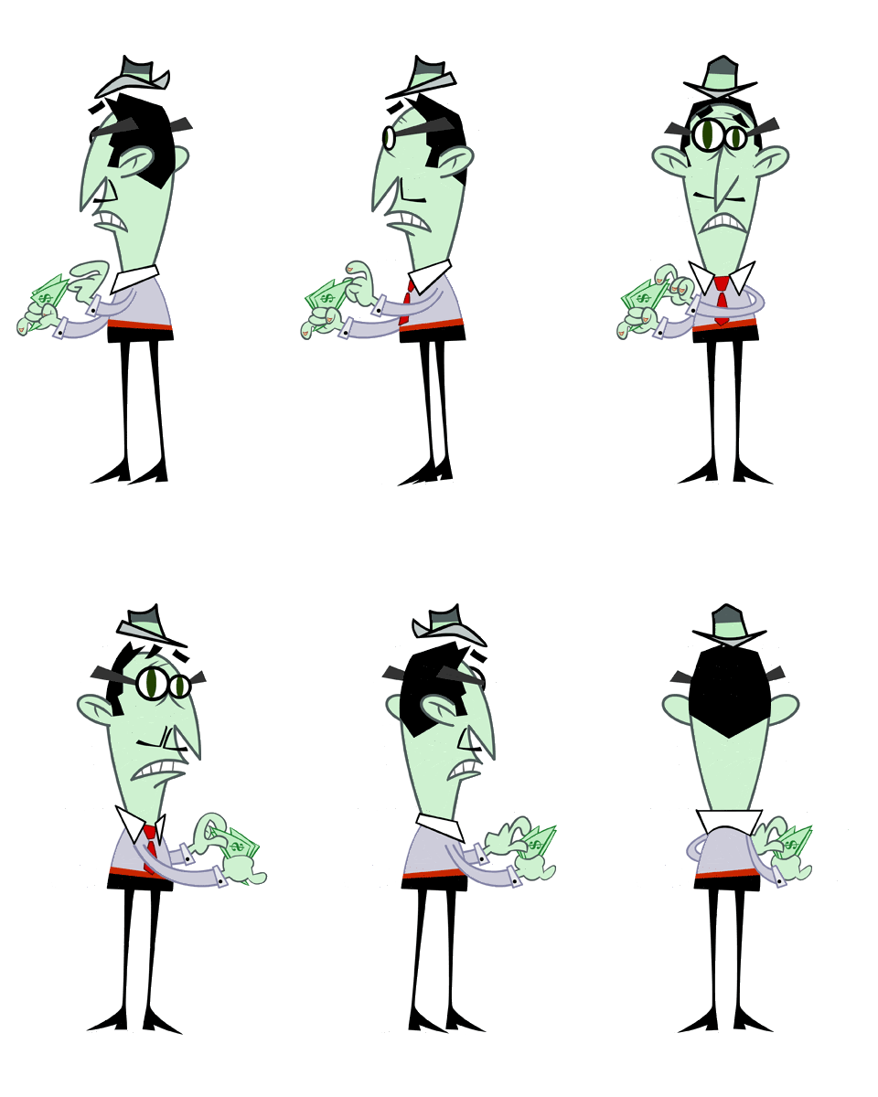
 Even flat designed characters need to be able to rotate. There are many cheats when rotating flat characters; like his feet, I used the same leg and shoe in all the poses, just flip them and move them a bit for each view. Same with the hat. He is never going to be rotating like this in the show, so I could get away with such cheats.