

Caricatures are not supposed to be flattering. They are supposed to be funny. I actually like this how this one turned out, even though it may not be flattering, it is still appealing. I used to watch
YARDLEY JONES on TV, that must have been more than 16 years ago. He taught how to paint and caricature and draw on his show, this was way before the day of digital media, he used good old fashioned water color, paper, ink, pen, and marker. He had this great method of painting his caricatures; he would ink the caricature on a sheet of acetate, much like an animation cel, then he would loosely water color the caricature on water color paper. He would then place the cel over the water color, once it has dried of course, and voila! A caricature in color with a nice black thick clean outline. I was very impressed by this. So essentially that is the look I am going for here with the painted look with a solid black outline, only I did it digitally.


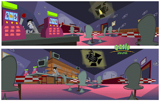
 I love the BAR FLY character! These are just some locations of the interior of the bar. It looks empty right now, but the club and the seats will eventually be filled audience characters.


 In the end I did all 7 caricatures in 2 styles; the graphic style below, and the more painted style above. I definitely prefer the style above.
 I had to do 7 caricatures. My original plan was to do them all in a clean, simple, graphic style like the image above. It was the fastest way to go, and I didn't have a lot of time.
 Here's the rough of this caricature. I did about a dozen of them before I settled on this one.
