Saturday, September 22, 2007

Bar Tender character lip sync


I like creating lip syncs. It's always much better when using a program like flash or toonboom or harmony to create lip syncs, because nobody is redrawing your lips over seas, there is no interpretation. What you create is exactly what you get. There will never be any animation corrections or retakes due to lip sync problems.

Friday, September 21, 2007

What Not To Wear


I needed to design a character that was frumpy. My inspiration for her is the show WHAT NOT TO WEAR. The show where they take women that look frumpy and give them $5000 to spend on a brand new clothes. This is usually what the women look like before the trasformation.

Thursday, September 20, 2007

clothing options


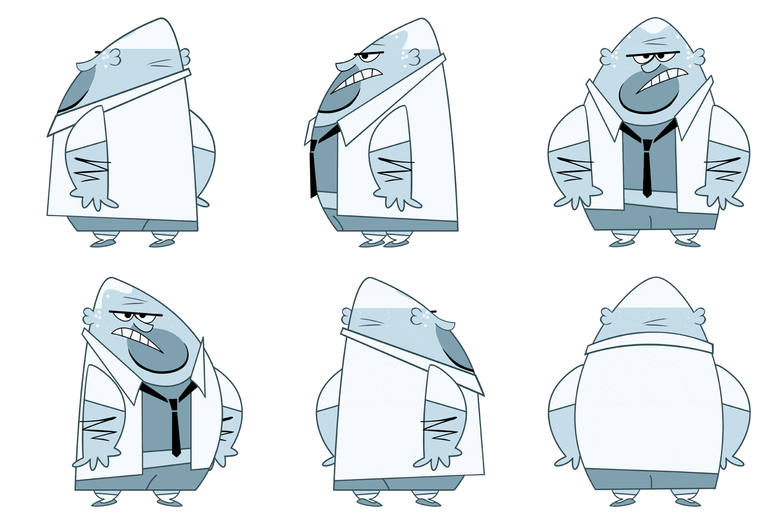
Here's the rough sketch and the 3 clothing options I designed for this character; wife beater with sweat stain, open shirt with tie, and closed shirt with suspenders. They chose the one with the tie.

monochromatic character


I always wanted to design a monochromatic character, and on this production I got to do just that. I was sure the color would get rejected and I would be told to make him "flesh colored" ...but to my surprise they loved it, and I didn't even have to fight for it or defend the design. It was a great feeling to be given the freedom to go nuts with the color and design. In every other production I have ever worked on I would have to draw badly on purpose to match the crappy style of the show, or be told things like "too cartoony" or "make it less interesting"

Wednesday, September 19, 2007

BAR FLY


He's more a part of the background or a prop, more than a character. Lots of comic potential for gags with this guy.

Tuesday, September 18, 2007

comedy club


A long shot, medium shot, and close up of a comedy club.

Monday, September 17, 2007

BRIDGE

So in the top pic, I darkened the sky and made it a crescent moon.I came up with a nice color palette, but the middle pic doesn't look enough like night time, and the full moon can be mistaken for the sun.

This is a shot of the Jacques Cartier Bridge in Montreal. It is used as the opening scene of this project.

Sunday, September 16, 2007

last crowd member

time to move on to something other than the incidental crowd characters. So here is the last one. I had a lot of fun with these designs.