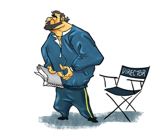
 This is the front of my business card. All my contact info is on the back. I think it's a cool card. It's plain, but at the same time kinda bold, plus it has a zombie on it.
Sunday, December 17, 2006
BUSINESS CARD
 This is the front of my business card. All my contact info is on the back. I think it's a cool card. It's plain, but at the same time kinda bold, plus it has a zombie on it.
Tuesday, December 12, 2006
Old liberals
Wednesday, December 06, 2006
TOM & JERRY
 Pretty much explains itself. It is a gameboy advanced Tom & Jerry game. I was an animator on it. This was several years ago. It was a lot of fun to work on, and the game got really good reviews. I still have my copy that they gave to everyone that worked on the game, still haven't even taken the plastic wrap off it. I don't know why I am posting this now. It just popped into my head.
Monday, November 27, 2006
updated my website
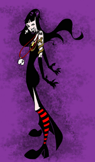

 I finally got around to adding some of the better stuff from my blog and putting it in the GALLERY section of my website. I filled up Gallery 1 and I started a second Gallery too! All with drawings from my blog. The last time I added anything to the Gallery of my website was probably just before I started blogging, 14 months and 140 blog posts ago. WOW! That's a lotta blogging! I am not keen on these posts without pictures, so here's an oldy, just so as not to have a drawingless post.
Saturday, November 25, 2006
Friday, November 24, 2006
SAMURAI ZEE SKETCH!

 Doesn't look like much in the sketch, but the COLORED VERSION turned out to look pretty good. Samurai Jack was another brilliant show. My favorite episodes are the ZOMBIE GRAVEYARD episode, the BLIND ARCHERS episode, and the BLACK NINJA episode. This is my last post for this weeks topic on ART JUMBLE. Now I need to get back to work.
Thursday, November 23, 2006
ZIPPY ZAP ZEE!

 Once again check out THE COLORED VERSION of me as a cartoon character. This time it's from the Power Puff Girls. See my other pics on ART JUMBLE too.
What's in a name?

 It's me as a FLINTSTONE'S character this time! Check out the COLORED VERSION I did for the "draw yourself as a character from your favorite cartoon" thread over at ART JUMBLE. I can't decide which Flintstne's name works best with my name. ZINC RISEK or ZEE ROCK or ZINC ROCK?
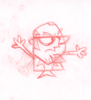
ZEE POSSIBLE SKETCH

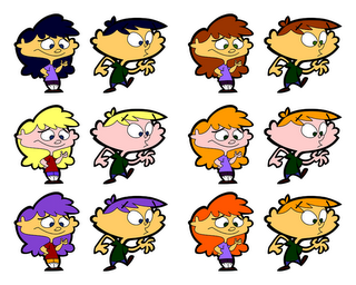
 This is a sketch for a thread over on the ART JUMBLE BLOG. The topic is "design yourself as a character from your favorite cartoon." I went with KIM POSSIBLE. THE COLORED VERSION is on Art Jumble posted on November 22 2006.
Tuesday, November 21, 2006
FINISHED GARBAGE MONSTER PAINTING!

This was my first time doing a digital painting like this, I've used painter a few times before, but that was more coloring, not painting. I could spend more time on this and touch up areas and make adjustments forever. The toughest part of any painting, digital or not, is putting it down and saying "That's enough." I could easily have done more to the goldfish, but I justify it by telling myslef he's in glass, so it doesn't matter if he looks a bit flat.
STEP 4
 Not done yet, but I did add a cast shadow of sorts on the ground. But the main thing is that it's a lot darker now. And he looks more slimey. The bones sticking out of him are too bright right now, I need to tone them down. Still working on the tail. And I need to fix where the bones are poking through his flesh. Up next, step 5! Just about finished!
Monday, November 20, 2006
Monster - Step 3
 In this step I basically added some basic shading to the jar on top of his head, the bones, the drool, and the goldfish. The goldfish still has some work to be done on it. So does the monster. But it is mostly there, all that is next is to go in with the details and make sure that the shading defines the forms. I have been neglecting his tail, it needs to be better defined with light and shadows. The next step might be the last. Stay tuned for Step 4, it's all about the details!
Step 2
Step 1 of a monster painting

I'm working on this monster in painter. I will post various stages of progress on this. So here's stage 1. Pretty much a flat wash BG at the moment. Got my overall shading scheme for the monster. A few highlights on the mouth and brow, just to get an idea how he will start to look fleshed out in that area. Did a fair bit of work onhis eyes. Stay tuned for step 2!!
Sunday, November 19, 2006
CAPTAIN TOXOID
 He's one of the main characters in another pitch of mine. He has a kitchen sink for a body, a tool belt full of plumbing equipment, a plunger, a squeegee, a rubber stopper, he has hot and cold water taps for ears, a faucet for a head, and his cape is a bath towel with the word HIS on it, from a HIS and HERS matching set.
Saturday, November 18, 2006
1989
 I was cleaning up my place, throwing out old papers, when I came across this caricature of yours truly. It was done by BRIAN LEMAY, way back in 1989/90 when I was in the Sheridan College Animation Program. I was a student, he was my teacher. The likeness is spot on! At least it was back then when I had hair and used to work out. I always loved Brian's work. His character designs on Inspector Gadget were wonderful. I learned a lot from him.
Friday, November 17, 2006
Thursday, November 16, 2006
UP NEXT....NEW YORK
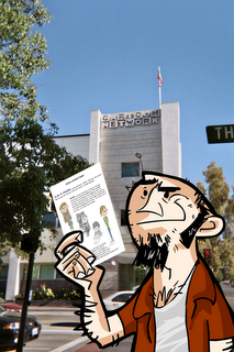
I wish I took more photos inside the Cartoon Network Studio, but I wasn't about to snap my camera at all the animation desks and toys and posters and drawings and animators, after all, I had a pitch to do. That's a page from my pitch package in my hand. I owe a huge thanks to my brother, Rob, and my friend, Errol, for doing the drawings for me. Long story short, the next step is to pitch it to the Cartoon Network Office in
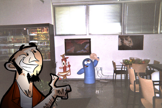
ME AND BLOO!!!
Wednesday, November 15, 2006
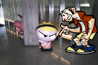
ME AND MANDY!!
Tuesday, November 14, 2006
In good company.
I want to give a big THANK YOU to the guys over at IT'S JERRY TIME for giving me a nice link (with a way cool banner and everything!!!) on their WEBTOONS PAGE. CHECK IT OUT!!! It's amazing to be mentioned in the company of some great, super popular, sites like JIB JAB, ODD TODD, JOE CARTOON, OOOH BITEY, and FREDERATOR. I have been a fan of many of these sites for a long time. Keep up the great work!!
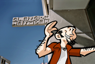
Me in Burbank
Saturday, November 04, 2006
Thursday, November 02, 2006
BULLY
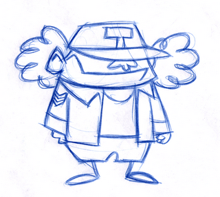 Here's a very funny looking bully character. I drew this, but I can't take credit for the very cool design. He was designed by ERROL BURKE. He is very fun to draw, because he looks like Angus Young from AC DC. I was told the 'T' stands for TROUBLE. Perfect!
Sunday, October 29, 2006
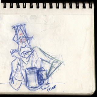
DR. JOHNNY FEVER from WKRP in Cincinnati
Bailey Quarters from WKRP in Cincinnati
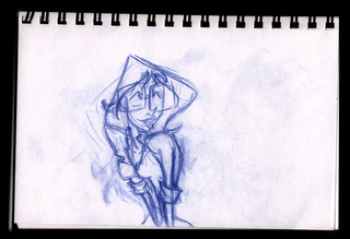
I am working on a pic of the whole cast from the show. It was one of my favorite shows of all time. Every single character was unique, interesting, had an individual look and was an archetypal character. This BAILEY QUARTERS. JAN SMITHERS was perfect in this role; shy, quiet, smart, but bursting with potential and ambition underneath those glasses.
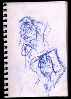
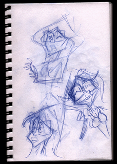 My approach for this WKRP drawing, is not do to caricatures in the traditional sense. By that I mean I am not necessarily doing a caricature of Jan Smithers here. My approach is more like a character design approach. I am not trying to get a specific likeness of Jan Smithers, I am trying to capture the essence of her Bailey Quarters character.
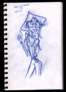
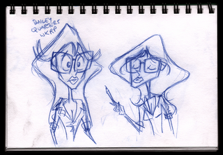 I’m still working on her. I think I’m getting close to what I want.

 My approach for this WKRP drawing, is not do to caricatures in the traditional sense. By that I mean I am not necessarily doing a caricature of Jan Smithers here. My approach is more like a character design approach. I am not trying to get a specific likeness of Jan Smithers, I am trying to capture the essence of her Bailey Quarters character.
 I’m still working on her. I think I’m getting close to what I want.
Here she is…for now. She may be tweaked a bit before the final design is drawn. But I am pretty happy with this one. Now, onto the next WKRP character.
Sunday, October 22, 2006
Still no pic....
...but there is one coming soon. I am working on a caricature that I wanted to do for a long time. Years, in fact! I don't want to ruin the surprise, but I will be posting the roughs soon. Until then, here is a link to FEED- animation_vfx_design blog. There is a nice post about the Ottawa Animation Festival. Look for the post dated Monday, October 2, 2006, called ONLINE OTTAWA X2. My propaganda parody films are mentioned.
Tuesday, September 26, 2006
WHAT?! No pic?!
No pic in this post, just a link to an article in BROADCASTER MAGAZINE. There is an article on the OTTAWA ANIMATION FESTIVAL, and my propaganda shorts are mentioned. I like their description of the Z-FILES, "zombie-filled, outrageously comical twist on 1950's nuclear propaganda films."
Monday, September 25, 2006
GOD
Sunday, September 24, 2006
more pilot screen shots
BACK FROM THE OTTAWA ANIMATION FESTIVAL

I just got back from the OTTAWA ANIMATION FESTIVAL. I had a blast! I met some amazing people. Everyone was super nice. Now I have one week left to finish this pilot. I could have used those 5 days I spent at the festival working on this, but it was an opportunity I could not afford to miss out on. I want to thank everyone involved in putting the festival together and everyone attending the festival too. Thank you very much. It was my first time at the Ottawa Festival and I will definitely be going back every year from now on. I added some new links, to the right, to some of the great people I met at the festival.
The guy in the bath robe and slippers, above, is God. I really like how this pilot episode is turning out. The working title of the show is PETE & BOB. The animation is very South Parkish. So I should be able to finish it in a week. There are several other posts in this blog about this project. If you go through the archives of the past 3 or so months, you'll see other screen shots, some of which were just tests and experiments. The screen shots above are not tests. That is the final look of the pilot.
Monday, September 11, 2006
PAINTER experiment #2
Saturday, September 09, 2006
FOOD AND FALLOUT rough sketches
WIND DIRECTION rough sketches
WONDERFUL SIGHT rough sketches
Awful Gas rough sketches
 It is less than a couple of weeks away from the Ottawa International Animation Festival. My web cartoon series, THE Z-FILES, will be screening at the festival. Here are the scribbles that I did for the first episode, AWFUL GAS. On the bottom right, you can see that my original idea was to have the lady mutate into a plant like creature, it was my tribute to LITTLE SHOP OF HORRORS. I ended up not going with the plant and instead had her mutate into a multiple eyed octopus type creature.
Subscribe to:
Comments (Atom)


