Thursday, December 16, 2010
new banner
Time for a new banner! No, it's not a Planet of the Apes blog. I just decided to use my ape pics as the theme.
Tuesday, December 14, 2010
screen shot, long shot, three shot
The top pic was something that I posted before from this project. It shows how rough the storyboard was, and how the board was done before any character designs were made. So instead of two male angels in the board, we now have a male and female. In the new pic on the bottom, the horse has been added to the shot. The animation in this scene is completed, the only thing that I might still do to it is play with background, or not.
Friday, December 03, 2010
Angel/Devil
She has a line of dialog where she talks about 'conflict' so to emphasize the dialog I have her briefly become Devilish before snapping back to her usual angelic self.
Wednesday, November 24, 2010
Friday, November 12, 2010
great voice acting
I am animating an 11 minute short film written by Ken Edwards. The script is great, which is why I took on this project. And if a funny script wasn't enough, the voice acting is superb, just listen to the voice acting by Steve Rimpici. He plays multiple parts in this film; in the scene here, he plays St. Peter.
Friday, November 05, 2010
wipe
One of my favorite tricks to use in animation is the wipe. If you need a quick action and don't have many inbetweens to work with, a wipe is always a good way to go. I used to do an exercise where I would watch cartoons frame by frame on the old VCR, just to see how they did the wipes. One of my favorite shows for good wipes was Tiny Toons, they were pretty extreme with some of their wipes. Here's a wipe I used on a project I am working on.
Saturday, October 30, 2010
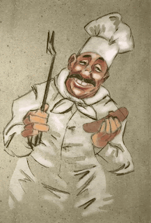
chef
Another old pic that used to be on my website. I got rid of the website, so I'm posting some of my work that used to be on the site here on my blog. It's all really old work, but some of it is still worth posting, like this friendly guy ready to share his transparent sausage.
Friday, October 29, 2010
Oliver Domenchini
My friend Oliver. This is one caricature I had to bring over from my now defunct website, because it captures Oliver so well.
stare
I had a difficult time drawing her. Her name is Sarah, she is a beautiful life drawing model, and in this pose she was staring right at me the whole time.
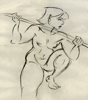
pole 2
This model was drawing with us, just another artist, until one week she decided to cross over from life drawer to life drawing model. Gutsy.
watercolor Nirvana
Kurt Cobain in watercolor. I did this years ago, this is another piece that used to be on my old website. I was inspired to paint something using 2 colors, blue and orange. I like how blue and orange play against each other. I was also listening to Nirvana when I got this blue/orange inspiration, and this is the result.
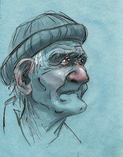
old dock worker
I have abandoned my website. I let it expire, it is no more, gone, vanished, KAPUTT. From now on it's just my blogs. I find blogs much easier to update. My website has been static for years, yet my blog is regularly updated. I am going to post some stuff that used to be on my website to this blog, only the better stuff, as most of it was old and not worth posting here. This is one of my pieces that is worth posting here. It's my favorite portrait ever did.
Thursday, October 28, 2010
splash
This is another scene I worked on for Ugly Americans. It was so nice to work on frame by frame, hand drawn, traditional animation (albeit digital), rather than that tweened puppet animation you see a lot of these days. The show turned out fantastic, looks great.
Tuesday, October 26, 2010
an unfinished scene
< This is one of the scenes I animated on a Comedy Central series called "Ugly Americans", produced by Cuppa Coffee. There were some changes made to this shot, this is one of my earlier versions, not 100 percent completed, as you see by the lack of movement in the body of the demon on the second shot with the tail. There were also some blood splatters in the final version.
Thursday, September 16, 2010
Friday, July 30, 2010
Friday, July 23, 2010
So excited!!!!!
A few weeks ago I finally bought a Cintiq. I have been wanting one desperately for a long time, and I finally bit the bullet and got one. I had to purchase it for a gig I wanted. I got the Cintiq, I got the gig. I am working on a show called Ugly Americans. The production keeps me very busy so I haven't had much time to fool around with the Cintiq on my own stuff. So I finally got around to doing this sketch tonight with my new piece of equipment. As for Ugly Americans, all I can say is this; Finally, after a long career in animation, I know what it is like to work on a show that I am actually a fan of myself. I have often wondered this; what would it be like to work on Sponge Bob, or Flap Jack, or Fosters, or the Venture Bros, or any other show that I really like. Now I know, it feels every bit as good as I thought. Anyway, check out Ugly Americans on Comedy Central on TV and you can also watch full episodes on Comedy Central's website.
Tuesday, July 20, 2010
Old Kung Fu Master
My girlfriend and I came up with an idea for a great little animated short, it is a spoof of 'The Five Deadly Venoms." This is the the first rough of the Old Kung Fu Master. This short is going to be an educational piece to teach kids. No, it's not going to teach them how to 'climb walls' like the Lizard, or have 'iron skin' like the Toad. It is going to teach them a grammar lesson.
Tuesday, June 29, 2010
T-Rex walk
Normally I would bob the head up and down, but because this is part of a pan and the T-Rex will also move his mouth during a lip sync as he walks, I decided to keep his head stationary.
Monday, June 28, 2010
Wednesday, June 23, 2010
Elephant and giraffe walk cycle
Monday, June 21, 2010
Sunday, June 20, 2010
VADER TIME!
A couple quick rough drawings. PAPA SHANGO on the left. BIG VAN VADER on the right. VADER was definitely one of my all time favorites. He was scary!
Saturday, June 19, 2010
Papa Shango
I felt like drawing a wrestling character that I always liked, PAPA SHANGO. I may keep working at this, refine it, add details, that kinda thing. This rough sketch is just the start.
Friday, June 18, 2010
lightning effect
This is an example of a very easy, yet very effective, lightning effect. Step 1- Take the frame before the lightning is supposed to flash. Make it a png image and bring it into photoshop. Step2- In Photoshop; duplicate the layer. Step3- Use the Image-Adjustments-Threshold, to change the duplicated layer into a black and white image. Step4- You have two options. You can either duplicate the black and white layer and simply do Image-Adjustments-Invert, or you can duplicate the color frame again but adjust the threshold to make it look different than the previous threshold adjusted layer. Step5- Again duplicate the color layer and make a third threshold adjusted layer that is different than the other two. Step6- Export each of the three black and white layers as separate png files, import the png files into whatever program you are using, Flash, ToonBoom, or After Effects, insert the png's into frames, on two's or ones, or a combination, whatever works for the scene.
It ends up looking like THIS EXAMPLE from my earlier post.
It ends up looking like THIS EXAMPLE from my earlier post.
Wednesday, June 16, 2010
T-Rex front view
We see this T-Rex from two angles, a three-quarter front view for most of his scenes, and this front view for only one or two scenes. I added a bit of brush work to the tree in the background.
Tuesday, June 15, 2010
mirrored shades
I like how I designed this angel character, with the tube-like body and simple lines. Here she is wearing mirrored sunglasses, like a cop. Call me retro, call me nostalgic, but I think mirrored shades are the coolest shades ever.
Monday, June 14, 2010
horse back ape
Saturday, June 12, 2010
see no evil, hear no evil, speak no evil
Friday, June 11, 2010
slave labor

More 'Planet of the Apes' fun, with a recycled old BG I did a couple years ago. I just changed the colors of the BG so that the red jumpsuits 'pop.' One thing I never understood about Planet Of The Apes, as kid, was if they were supposed to look like real apes or a more humanized ape? Were the chimpanzees supposed to be the size of a real chimp? Were the gorillas supposed to be big 300 pound apes? I always figured they were, but special effects at the time were not advanced enough to make that happen. So both chimps and gorillas had the same body size as the humans.
Thursday, June 10, 2010
DO
 I just watched all 5 of the original planet of the apes movies. In order, it goes; Planet of the Apes, Beneath the Planet of the Apes, Escape from the Planet of the Apes, Conquest of the Planet of the Apes, Battle for the Planet of the Apes. The first movie was simply brilliant, written by Twilight Zone creator, Rod Serling. Of the 4 sequels, 'Escape' was the best one. The others, honestly, are not so good. And the last movie, 'Battle', is pretty awful. The cinematography is not big screen quality, the set designs are bad, it just feels really cheap, like a poorly produced 'made for TV' movie, even by the standards in the 1970's. Even so, there are some great ideas in all of the films, like apes wearing jumpsuits!
Saturday, June 05, 2010
planet of the humans
Monday, May 31, 2010
covered in snot


I could have drawn the snot covering the angel many ways, but I went with the straight palette knife look. One of my favorite shows, 'The Venture Bros." uses this look when they do blood splatter effects. When I first saw Brock Sampson covered in blood that looked like it was painted on with a palette knife with straight edges, I took notice and wanted to use the same effect. So here's my chance...except it's mucus not blood. But what the heck, it's still body fluid.
Sunday, May 30, 2010
Saturday, May 29, 2010
Friday, May 28, 2010
Thursday, May 27, 2010
Subscribe to:
Comments (Atom)


