I love the BAR FLY character! These are just some locations of the interior of the bar. It looks empty right now, but the club and the seats will eventually be filled audience characters.
 I love the BAR FLY character! These are just some locations of the interior of the bar. It looks empty right now, but the club and the seats will eventually be filled audience characters.


 It's a very rough thumbnail, but I think you can make out the rock path and the bits of orange/red along the path are leaves on the ground. I am loving COREL PAINTER!
 I'm experimenting with painter. This is a path through a wooded area of the Wellesley College campus. It's just a little painted thumbnail, no details or refined areas, just playing with color and composition.
 In the end I did all 7 caricatures in 2 styles; the graphic style below, and the more painted style above. I definitely prefer the style above.
 I had to do 7 caricatures. My original plan was to do them all in a clean, simple, graphic style like the image above. It was the fastest way to go, and I didn't have a lot of time.
 Here's the rough of this caricature. I did about a dozen of them before I settled on this one.


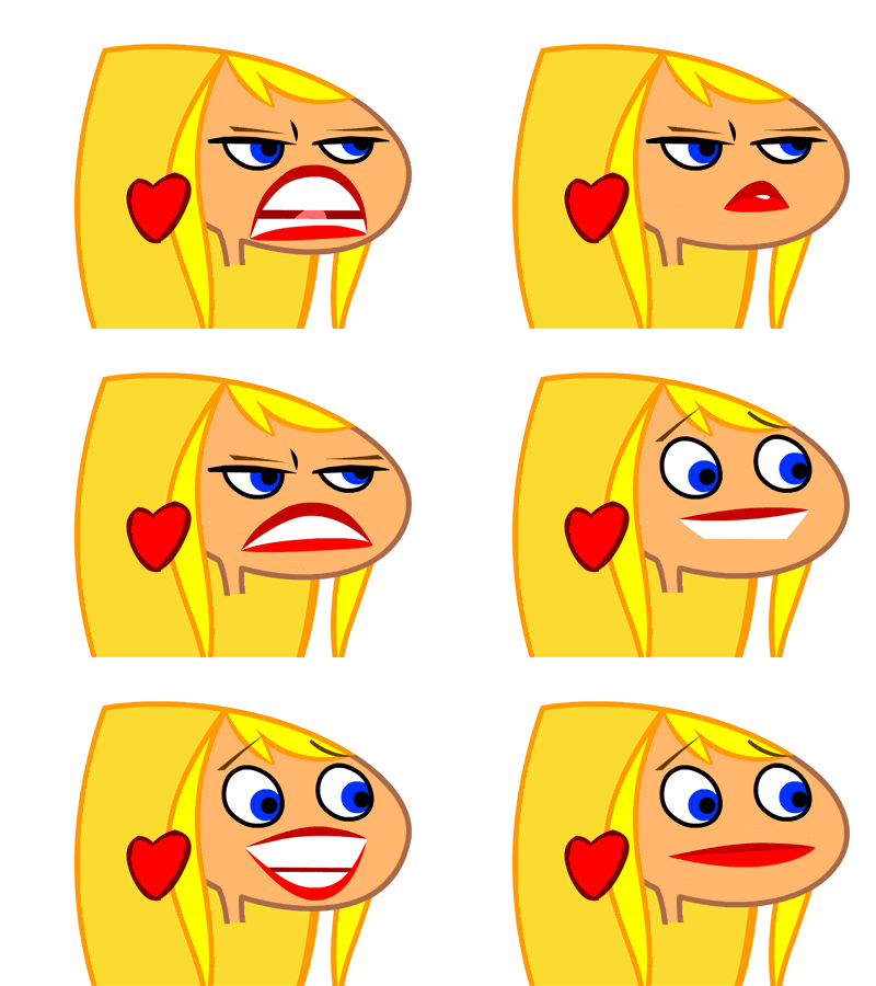
 To help the animators I did a page of facial expressions and rough poses of Ginette sitting. I was told it helped them a lot.
 Here are the characters you've seen thus far in a mock scenario. I kept the BGs as simple as possible. I used rejected designs in the photo frames on the location design on the walls of the club. Hey, why let rejected designs go to waste?
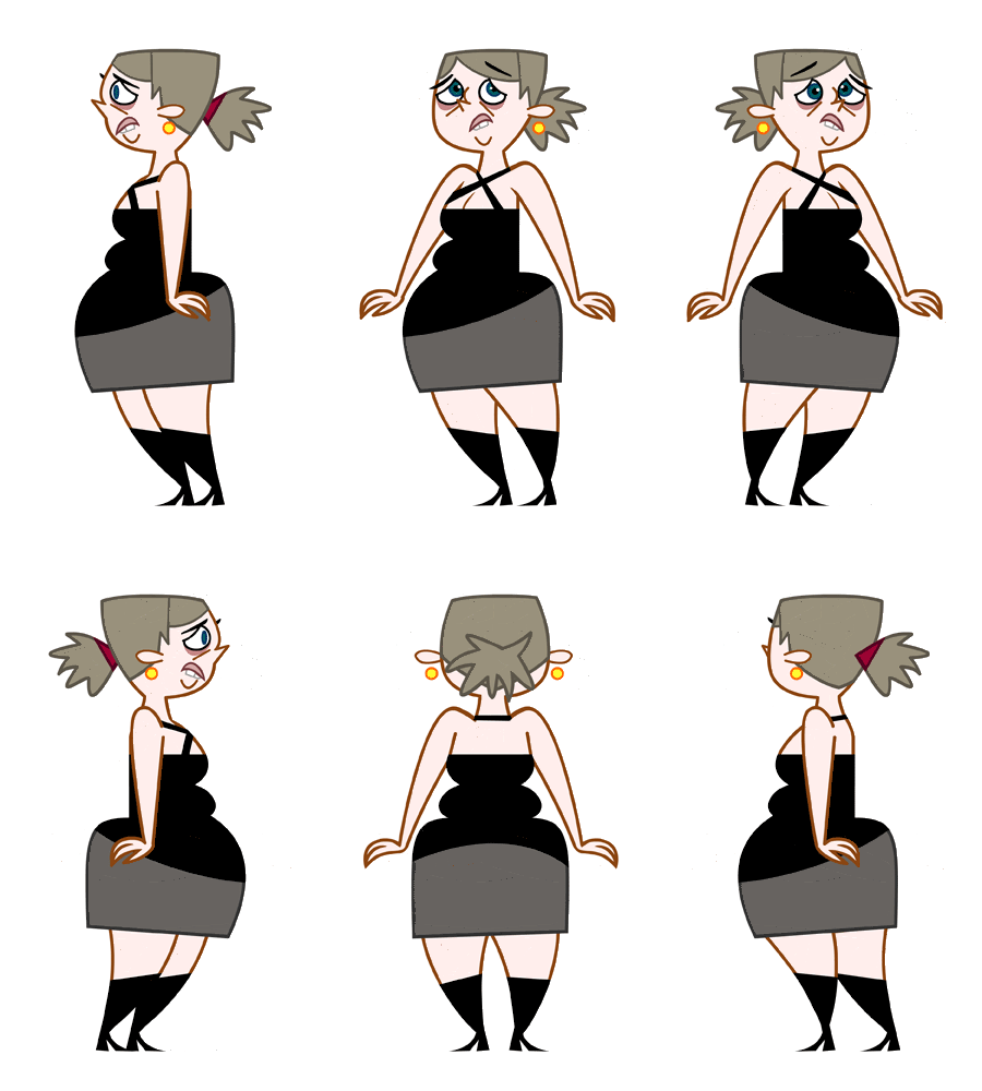
 I was told to design an ugly, depressing, miserable, lonely girl. So I came up with this goth chick on the left. They didn't want her to be a goth, so she was rejected. Then they said that she wasn't supposed to be necessarily UGLY, just desperately in love with the main character, but kinda homely. So I designed the frumpy chick in the middle here. She was also rejected. They wanted her to be older, a cougar. So I came up with the design on the right. They liked that one, but I would have preferred the design in the middle as the main character. We did use all the 3 designs. The 2 rejected characters were used as incidental characters.
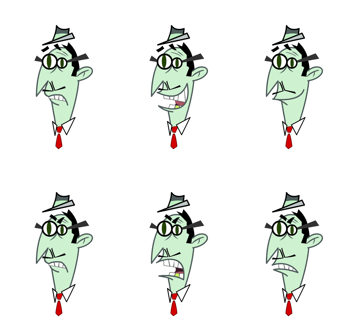
 Another lip sync. This is the 4th production that I did lip syncs on, and on 3 of those 4 I was the only one doing lip syncs. On DAFT PLANET, ZANNI, and STAND UP TV, I created all the lips by myself, and on MY GOLDFISH IS EVIL, I was on a team of 3 guys creating lip syncs. Some people don't like doing them, but I think they're fun to do.