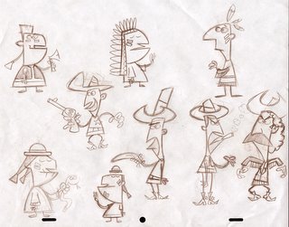
I like this simple flat style of design. I like how you see both eyes but the face is like a profile. I may try to do a style like this for the next web episode of "THE Z - FILES," even though the first 4 episodes were not in this style at all. It would be interesting to see how it works with what I am trying to get across in The Z-Files. If it doesn't work, I will still do some animation with this flat retro UPA look to it.

2 comments:
looking great! These guys look like they'd be a blast to animate.
Great little characters! I love the style!
Post a Comment