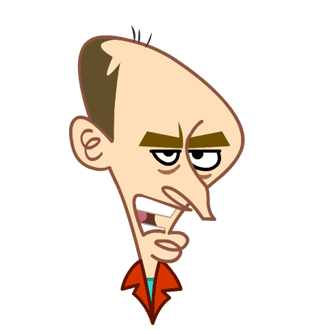
 One of the things I wanted to do was give Emperor Bubbles a thing on his head, like Ming The Merciless would have on Flash Gordon. Again, it would have made him more retro sci-fi looking and less Darth Vaderish looking. It would only have required a couple of lines across his head and a different color on top of his head. But I was told that it would require more work and more coloring, and so the cap on his head was rejected. It was an unfortunate decision, he would have been so much better with it on. But that was one issue I did not feel like arguing over, so I let it go. The over all retro 1950's sci fi theme was not pushed in the design of the show. When we wrote the script we were expecting to also be on the character design team, so we thought we would be in house, in the studio, to make sure that the designs were what we envisioned for the episode. Unfortunately, we were not working in the studio for season 2, and many of the character designs strayed from the retro theme. For instance; there was a Robo Cop character designed. We didn't use him at all, and pretty much threw out that page of the model pack.

Monday, December 31, 2007
skull cap
One of the things I wanted to do was give Emperor Bubbles a thing on his head, like Ming The Merciless would have on Flash Gordon. Again, it would have made him more retro sci-fi looking and less Darth Vaderish looking. It would only have required a couple of lines across his head and a different color on top of his head. But I was told that it would require more work and more coloring, and so the cap on his head was rejected. It was an unfortunate decision, he would have been so much better with it on. But that was one issue I did not feel like arguing over, so I let it go. The over all retro 1950's sci fi theme was not pushed in the design of the show. When we wrote the script we were expecting to also be on the character design team, so we thought we would be in house, in the studio, to make sure that the designs were what we envisioned for the episode. Unfortunately, we were not working in the studio for season 2, and many of the character designs strayed from the retro theme. For instance; there was a Robo Cop character designed. We didn't use him at all, and pretty much threw out that page of the model pack.
Sunday, December 30, 2007
Is this a joke?!

 When we wrote the script, we specifically described this contraption as a "War Of The Worlds" type machine. It should have had long spidery legs or tentacles and roundish head, very retro looking. Instead; as we were storyboarding, I saw this in the model pack. I was sure it had to be a joke. I added the testicles in blue pencil and Errol added the main character bent over ready to be humbled by the phallic creation. Then I realized that it was not a joke. This is actually the model we were expected to use. There was no way we were going to use this horrible thing, not only was it extremely phallic, it was not what we described in the script, it was not retro and did not resemble "War Of The Worlds", it was completely wrong. So we just did our own design and said to hell with design in the model pack. I was sure this would get changed back to the phallic drill by someone in the studio doing storyboard corrections, but to my surprise, as you can see by the screen shots above...it stayed in!
Saturday, December 29, 2007
Friday, December 28, 2007
end credits
 The end credits of My Gold Fish Is Evil is the best part of the whole show. It looks different than the show, it is full of quick zooms in and out and is pretty exciting.
on the air

Sorry about the poor picture quality, but these screen shots are taken from a VHS tape that I recorded with my VCR. Now I know how my parents felt when I was a kid and they were still using an 8 track player when I was using cassette tapes and a Sony Walkman. Anyway, this is from an episode of My Gold Fish Is Evil. It was written and storyboarded by Errol Burke and myself. As far as Gold Fish episodes go, I think it is the best one I have seen, but that is not saying much. After I watched this episode, I watched an episode of My Gym Partner's A Monkey. What a difference!! My Gym Partner's A Monkey is fantastic, hilarious, excellently paced, great voice acting, timing, great gags, great designs. The Episode I saw was the one with the koala girl, Deidre. It was brilliant. It's everything Goldfish should have been, but is not. There is a long laundry list of things I hate about My Goldfish Is Evil. I won't rant about that right now. Instead I will enjoy my moment in the pic above.
Thursday, December 27, 2007
I'm on the cover!

 Okay, well it's not actually ME....but it is my art. This is the cover of this month's TOON BOOM NEWS, a magazine circulated in the animation industry to promote Toon Boom software and the studios using Toon Boom programs. The cover is a design I did for Oasis Animation. There are several posts from this production in my blog archives, pretty much all of September and October 2007 archives are just from this project. Am I mentioned in the article on the inside? Nope. But there is a fascinating interview with the guy that signs my check.
My Girlfriend is also in the magazine, well it's not actually my girlfriend...but it is a caricature of her. I've highlighted her in the top picture. She is one of the incidental characters in the club scene. When I showed her the picture in the magazine she screamed and giggled like a 10 year old girl, so I think she was happy about it.
Friday, November 16, 2007
SUBWAY JABBA

I saw this guy on the metro yesterday. It's a memory sketch, but I really wish I had sketched him on the spot, he was awesome looking. So many wonderful folds and crevasses. And his forehead was full of striations and wrinkles.
Monday, November 12, 2007
TOILET PUCK......
 ......has arrived!! He even has an official unofficial production blog. I also did some test animation to establish the style of the show.
Saturday, November 03, 2007
ARTHUR CARLSON

GORDON JUMP was perfect as ARTHUR CARLSON. This is my first sketch of the "BIG GUY". Usually I am not happy with my first sketches, but this one has potential. I can see where I can exaggerate him more, it's a good start though.
VENUS FLYTRAP
 TIM REID as VENUS FLY TRAP. This was not my first attempt at Venus. I filled 3 pages with a bunch of sketches that were completely unsuccessful. This is the first one that is worth saving. Tim Reid was great as Venus. He was one of the straightest characters of the whole cast. His clothes were outrageous, but his personality was pretty normal compared to the caricatured personalities that surrounded him, same with Andy Travis.
Friday, November 02, 2007
HERB TARLEK again

This is my second sketch of Herb. I like it much better than the first. I'll try another one.
HERB TARLEK
 This is my first stab at FRANK BONNER as HERB TARLEK from WKRP IN CINCINNATI. The entire cast was memorable, but Herb was a real stand out. He was a jerk character that was likable at times. He was simultaneously loathed and sympathetic. He had some moments of fantastic comedy. His interactions with Jeniffer Marlowe/Loni Anderson were hilariously unforgettable. There are elements of this first sketch that I like and others I need to keep working on.
Thursday, November 01, 2007

Saturday, October 27, 2007
Friday, October 26, 2007
Thursday, October 25, 2007
gilles lip sync
 Notice I gave him different teeth in the angry positions than in the happy positions.
Wednesday, October 24, 2007
express yourself

Tuesday, October 23, 2007
ANDY TRAVIS take 2
 It's GARY SANDY again. Not too much different from the first caricature, this time I didn't show his eyes and his neck gets wider toward his shoulders. More Gary Sandy/Andy Travis yet to come!
ANDY TRAVIS
 GARY SANDY was perfect as ANDY TRAVIS in WKRP IN CINCINNATI. This is my first attempt at his caricature. After sketching out this first one, I have ideas for the next go at him. I'll see how far I can push certain things before it looses the likeness to Andy Travis.

Monday, October 22, 2007
poster

The idea I had for this poster was to make it look like the type of poster you might see at an actual comedy club. I think I captured the feel of a comedy club poster, and it is definitely better than the standard crappy promo pieces the animation industry usually turns out. Speaking of comedy clubs, just last weekend I saw JAMIE KENNEDY in a small comedy club. His stand up act was freakin' hilarious!
Friday, October 19, 2007
evolusion of a character design
 A few tweeks and...VOILA! Finally nailed it.
 They wanted him shorter, a cross between the too old version and the younger one. So I came up with this.
 And with a bow tie.
 So I knocked off about 40 years and made him taller.
This is Montreal comedian Gilles Latulippe. This is my first attempt at this design. I was told he was too old. They want him to look like a young Gilles, even though this is how old he looks now.
Thursday, October 18, 2007
facial expressions


Seeing Scott Falconbridge perform his stand up act live was a huge help when it came time to create facial expressions. He's got the craziest facial expressions I have ever seen. It was a blast to recreate his psychotic expressions in a drawing.
SCOTT FALCONBRIDGE
 Tweeked his hair a bit, and was requested to make him a bit shorter, which I did in this rotation.
  Clean, vectorized, and colored.
SCOTT FALCONBRIDGE


These are the rough sketches of Montreal comedian, Scott Falconbridge. I even got to see his stand up act at a comedy club in Montreal. It was hilarious!
Thursday, October 11, 2007


Wednesday, October 10, 2007

Friday, October 05, 2007
I love this guy!


 I love the BAR FLY character! These are just some locations of the interior of the bar. It looks empty right now, but the club and the seats will eventually be filled audience characters.
Thursday, October 04, 2007


Wednesday, October 03, 2007
Another caricature


Caricatures are not supposed to be flattering. They are supposed to be funny. I actually like this how this one turned out, even though it may not be flattering, it is still appealing. I used to watch YARDLEY JONES on TV, that must have been more than 16 years ago. He taught how to paint and caricature and draw on his show, this was way before the day of digital media, he used good old fashioned water color, paper, ink, pen, and marker. He had this great method of painting his caricatures; he would ink the caricature on a sheet of acetate, much like an animation cel, then he would loosely water color the caricature on water color paper. He would then place the cel over the water color, once it has dried of course, and voila! A caricature in color with a nice black thick clean outline. I was very impressed by this. So essentially that is the look I am going for here with the painted look with a solid black outline, only I did it digitally.
Tuesday, October 02, 2007
Oliver Domenchini

This character design is a based on a friend of mine, Oliver Domenchini. He is an animator at Oasis. Within hours of emailing this design to the studio, I got a call from the producer asking "The Assistant character looks like Oliver? Is it Oliver?" I had to laugh. I don't think anyone at the studio, including Oliver were expecting him to pop up as a character. Lots of cheats in this rotation too, especially in the arms. He is never going to rotate on the spot holding a cable like this, so it doesn't matter.
Monday, October 01, 2007
forest path
 It's a very rough thumbnail, but I think you can make out the rock path and the bits of orange/red along the path are leaves on the ground. I am loving COREL PAINTER!
Painter experiment
 I'm experimenting with painter. This is a path through a wooded area of the Wellesley College campus. It's just a little painted thumbnail, no details or refined areas, just playing with color and composition.
Andre - caricature 1
 In the end I did all 7 caricatures in 2 styles; the graphic style below, and the more painted style above. I definitely prefer the style above.
 I had to do 7 caricatures. My original plan was to do them all in a clean, simple, graphic style like the image above. It was the fastest way to go, and I didn't have a lot of time.
 Here's the rough of this caricature. I did about a dozen of them before I settled on this one.
Subscribe to:
Posts (Atom)