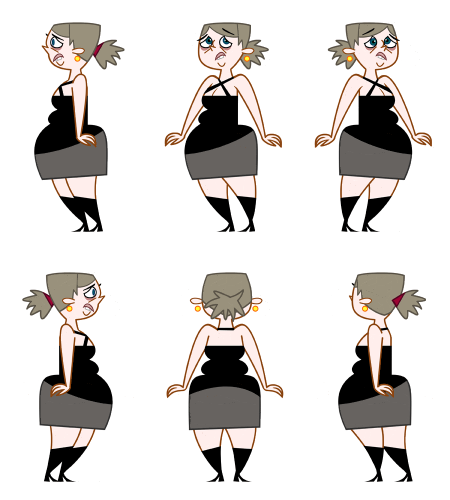
To help the animators I did a page of facial expressions and rough poses of Ginette sitting. I was told it helped them a lot.
 To help the animators I did a page of facial expressions and rough poses of Ginette sitting. I was told it helped them a lot.
 Here are the characters you've seen thus far in a mock scenario. I kept the BGs as simple as possible. I used rejected designs in the photo frames on the location design on the walls of the club. Hey, why let rejected designs go to waste?
 I was told to design an ugly, depressing, miserable, lonely girl. So I came up with this goth chick on the left. They didn't want her to be a goth, so she was rejected. Then they said that she wasn't supposed to be necessarily UGLY, just desperately in love with the main character, but kinda homely. So I designed the frumpy chick in the middle here. She was also rejected. They wanted her to be older, a cougar. So I came up with the design on the right. They liked that one, but I would have preferred the design in the middle as the main character. We did use all the 3 designs. The 2 rejected characters were used as incidental characters.
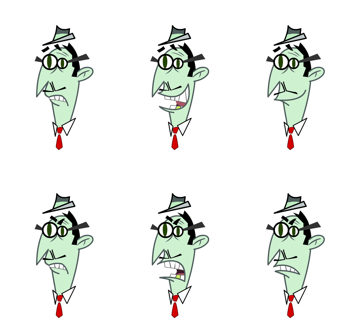
 Another lip sync. This is the 4th production that I did lip syncs on, and on 3 of those 4 I was the only one doing lip syncs. On DAFT PLANET, ZANNI, and STAND UP TV, I created all the lips by myself, and on MY GOLDFISH IS EVIL, I was on a team of 3 guys creating lip syncs. Some people don't like doing them, but I think they're fun to do.
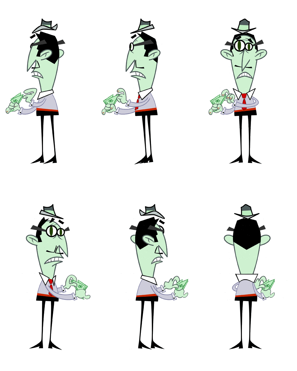
 Even flat designed characters need to be able to rotate. There are many cheats when rotating flat characters; like his feet, I used the same leg and shoe in all the poses, just flip them and move them a bit for each view. Same with the hat. He is never going to be rotating like this in the show, so I could get away with such cheats.


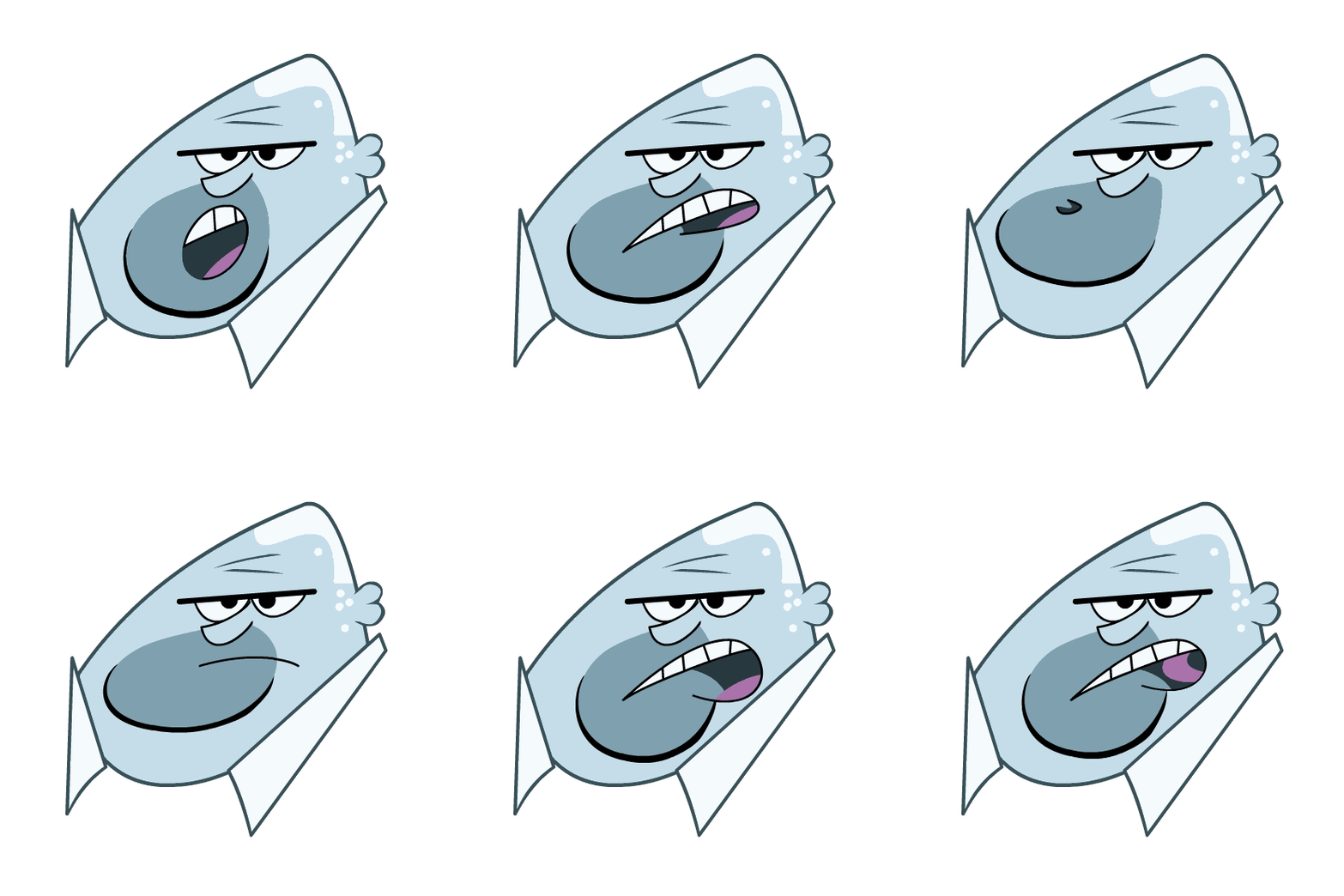
 I like creating lip syncs. It's always much better when using a program like flash or toonboom or harmony to create lip syncs, because nobody is redrawing your lips over seas, there is no interpretation. What you create is exactly what you get. There will never be any animation corrections or retakes due to lip sync problems.


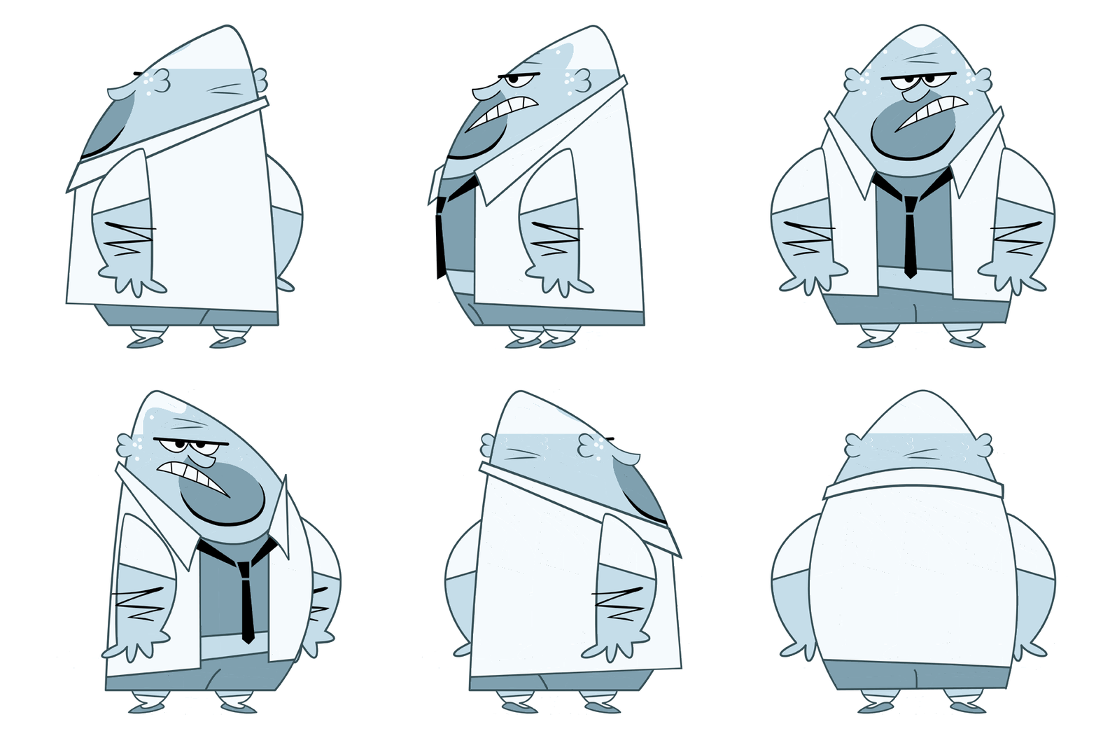
 I always wanted to design a monochromatic character, and on this production I got to do just that. I was sure the color would get rejected and I would be told to make him "flesh colored" ...but to my surprise they loved it, and I didn't even have to fight for it or defend the design. It was a great feeling to be given the freedom to go nuts with the color and design. In every other production I have ever worked on I would have to draw badly on purpose to match the crappy style of the show, or be told things like "too cartoony" or "make it less interesting"


 So in the top pic, I darkened the sky and made it a crescent moon.
 I came up with a nice color palette, but the middle pic doesn't look enough like night time, and the full moon can be mistaken for the sun.
 time to move on to something other than the incidental crowd characters. So here is the last one. I had a lot of fun with these designs.